As we discussed in our last post, mid-century modern interior design has transcended its 1950s roots, finding a place in today’s contemporary design landscape thanks to its more timeless attributes like bright, airy spaces, sleek lines, natural materials, and indoor/outdoor living. Many home buyers are drawn to mid-century ranch and split level homes for those reasons, but there are other features of these homes that haven’t always aged quite as well.
Brick fireplaces, dated entry dividers, dingy wood paneling, and bizarre tile color combinations often accompany the more attractive features of mid-century homes, but that’s no reason to count them out. Many of these retro design features can be updated quite easily, or even embraced in a way that mitigates their fifties flair in favor of a more contemporary aesthetic. Read on to see some common design hurdles, and how you can update them to create a home that is classic, comfortable, and fresh.
Wood paneling and ceilings
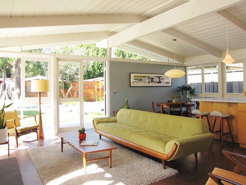
Whether on walls or ceilings, orangey wood paneling instantly dates a space and can make it feel dark and closed-in. If the offending paneling is well-constructed of real wood, you may want to consider having it refinished in a lighter shade. Pickled wood can look gorgeous with contemporary spaces. Paint is another good option. In the contemporary living room above, the beamed ceiling and trim are crisp white, giving the space a lighter feeling.
Entry dividers
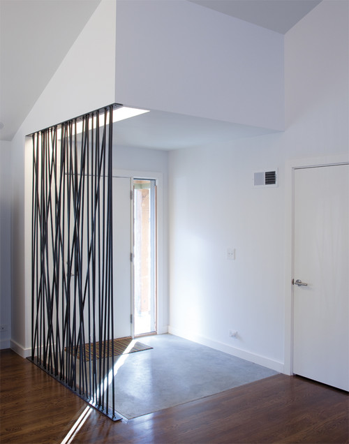
Some mid-century homes feature lovely entry dividers in glass, iron, or concrete that add graphic appeal to the space and still look great today. And others- well let’s just say they’re best left in the past. Depending on the layout of the space, you may be able to get rid of the divider altogether. However, if you still want that definition between entry and living room, there are many beautiful options to choose from. Consider etched glass, ironwork, or even a screen of branches to inject a rustic, organic element into the space.

Leave A Comment