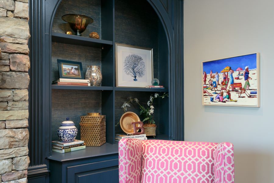
Whether you’re trying to populate a wall of custom shelving built-ins or style a single bookshelf, deciding what to include can be a challenge. We’ve decorated, accessorized, and edited many shelves over the years, and these are some of the strategies we’ve found helpful along the way.
Pay attention to scale.
One of the most common mistakes when styling shelving is to clutter it up with too many small items. Using larger pieces makes for a cleaner look and allows you to activate the full space of each compartment, as opposed to having a row of tiny items drowning in a large, empty space.
Strive for unity
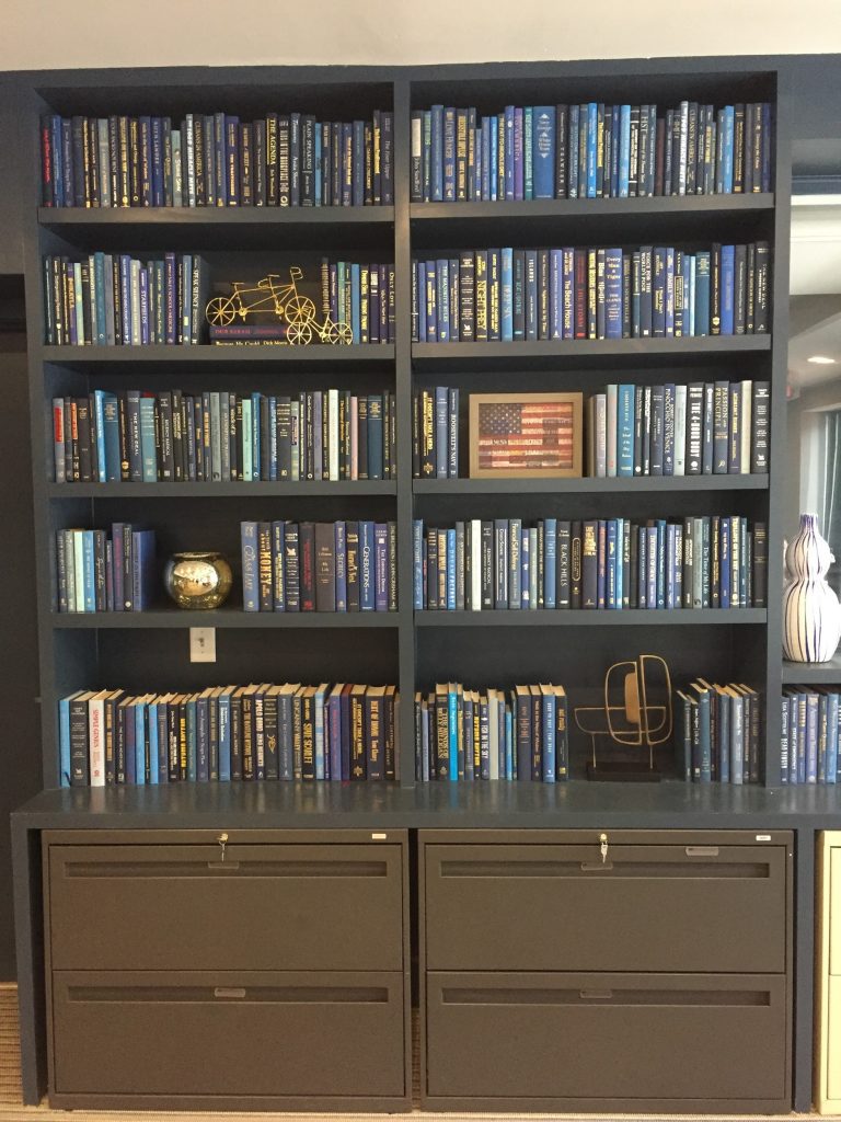
When styling your shelves, there’s no need to be constrained by perfect matching; in fact, for a more natural and effortless look, you should avoid it! Instead, opt for unity among the objects you incorporate into your display. They should relate to each other in some way, whether that’s a common material, color, or aesthetic, but there’s no need for matching everything.
In this custom shelving unit, brass decorative items of different styles live together while also bringing out the gold print on the spines of many of the books in the collection. Meanwhile, the horizontal lines of the framed flag art both echo and contrast with the vertical “stripes” of the books.
Get Creative with books.
When styling bookshelves, many folks fall into “library mode,” but remember – this is your personal library! You can display your books however you want, including allowing their formal properties to inspire the way you display them.
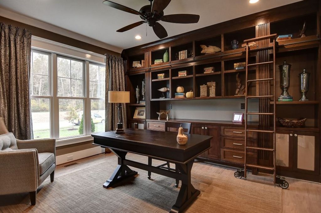
One really effective way to give your books more visual punch is to group them by color or color family. In this display, we grouped blue, green, navy, black, and violet books together. The cool tones harmonize with each other and create a nice contrast with the warm wood of the display cabinet.
You could also try this method with colorblocking, creating a rainbow effect, or grouping all of the books with pastel, jewel tone, or primary colors together. If you have a collection of beautifully-printed and bound books, you’ll probably want to show them off; however, you can also make your book collection work with your design goals by adding dust jackets in whatever color you like.
Here you can also see another important element of well-styled shelves: levels! By stacking some books horizontally and using them to elevate certain items within the display, you can not only add visual interest but also fill the space more fully.
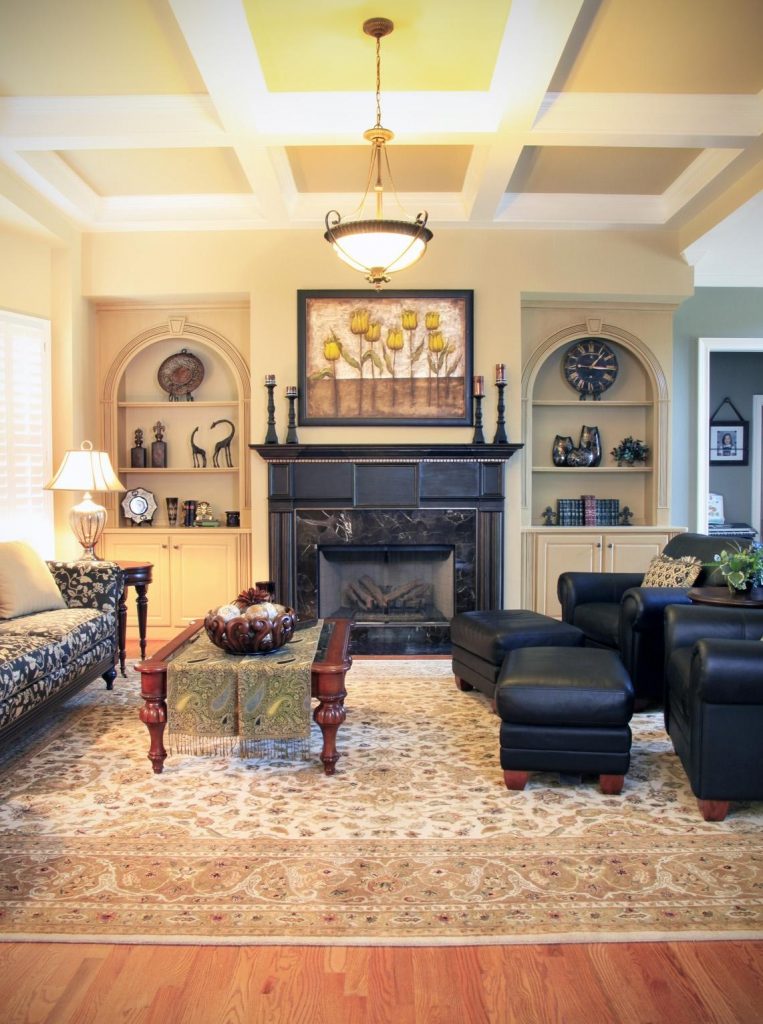
Keep negative space in mind.
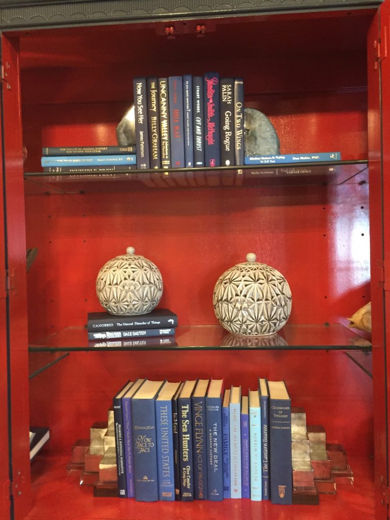
Negative space is simply the space around an object. When staging bookshelves, this concept is important to keep in mind because each section of the custom shelving is basically its own canvas; just like the composition of shapes and space on a painting, the way the objects interact with each other and their surroundings can make or break a display. Here we selected items with interesting shapes; the darker colors of the items help them to stand out from the light background of the built-ins. The round items on the top shelves accentuate the arched shape of each built-in while the lower shelves are populated with groupings of objects meaningful to the homeowner, arranged to fill the space and draw the eye through the collection.
If you need some help accessorizing your shelves, give us a call! We can help you put those finishing touches on your home with new accessories, or show you how to incorporate pieces you already own and love into your decor in a stylish way.

Leave A Comment